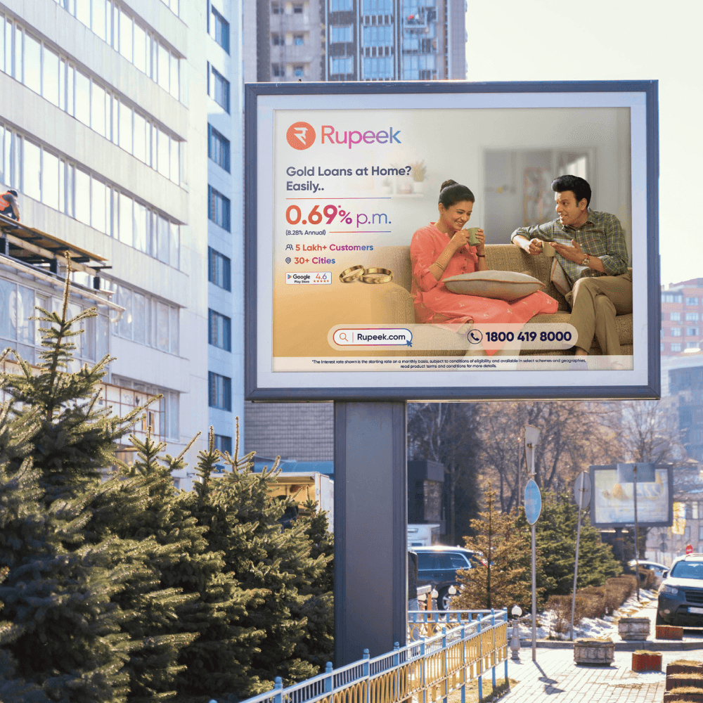
Mainteny
Client
Rupeek Prime
Year
2025
I'm partnering with Mugen to redesign their productivity platform. The goal is to make complex task management feel effortless through clean, intuitive design. This involves creating a seamless web experience that showcases their platform's power through purposeful animations and thoughtful interactions.
The visual system focuses on fluid motion and clear hierarchy, helping users understand how work moves through their platform. Through interactive demonstrations, users can quickly grasp how Mugen transforms their daily workflow, while maintaining focus on what matters most - getting things done.
What I Owned

The Situation
Ezetap had a loyal merchant base but the product hadn't kept pace. Feature adoption was low because merchants couldn't find what they needed - 700+ features buried in a broken IA. The design system was fragmented. UX debt had accumulated across years of band-aid decisions.
The acquisition gave us a rare moment of organizational permission to touch everything. Most teams would use it to change colors and logos. We used it to fix what actually mattered to merchants.

What I tackled
1. Rebrand done right Not a color swap - a full visual overhaul that applied Razorpay's design language with enough fidelity to feel native, while respecting the workflows Ezetap merchants already knew.
2. Core flows, simplified Login, dashboard loading, payment initiation — the everyday actions that merchants repeat hundreds of times a day. Each had friction. Each got redesigned from first principles.
3. EMI as a first-class feature EMI processing was an afterthought in the old product - bolted on, inconsistently handled.
I designed it end-to-end from inception to rollout, covering all 6 EMI options across the full transaction flow.
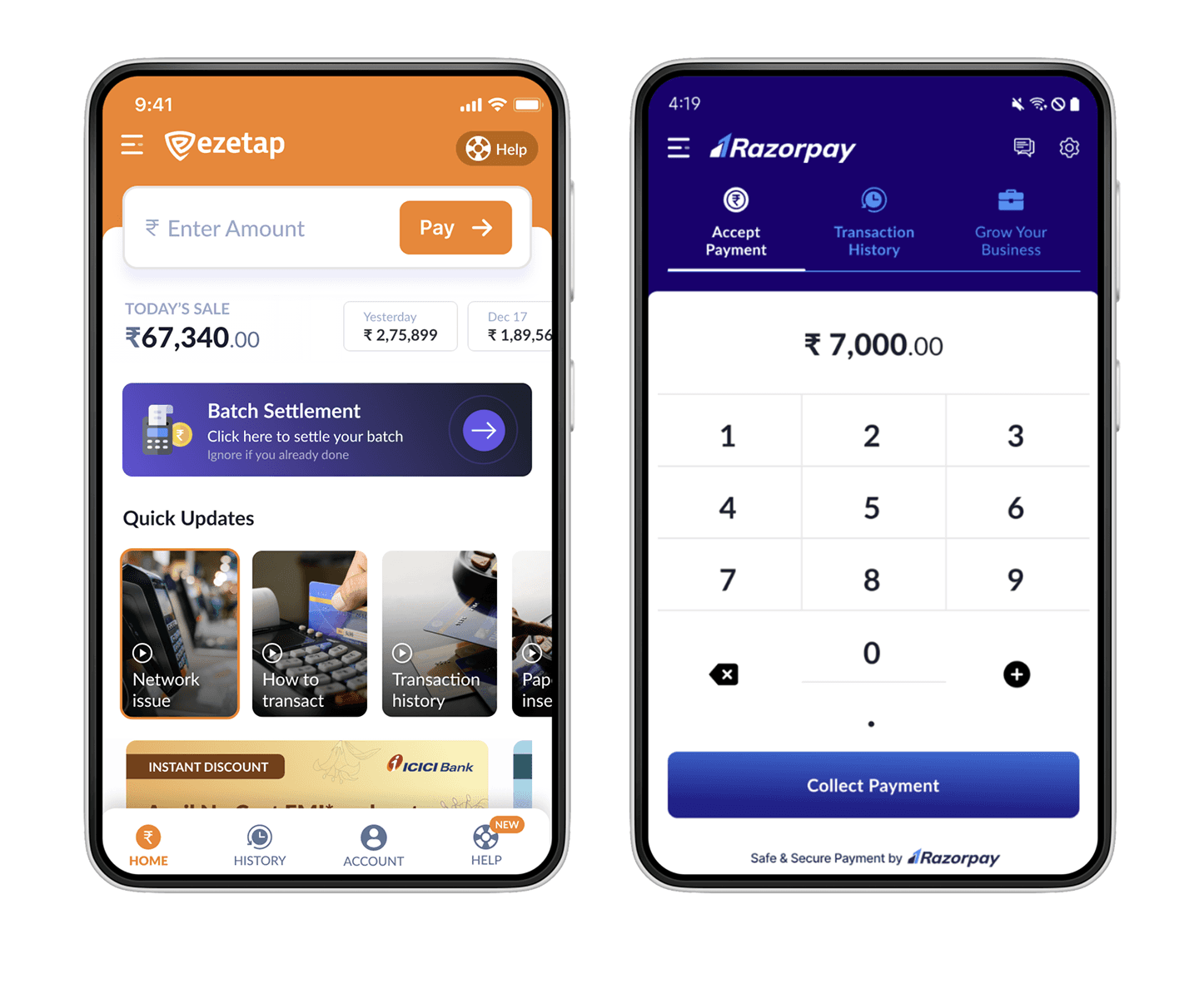
OUTCOMES
What changed | Result |
|---|---|
Transaction steps | Reduced from 7 steps to 3 |
Login failures | Significantly reduced |
Login time | Cut to under X seconds |
Dashboard load time | Noticeably faster |
App update completion | Higher adoption post-redesign |
Payment success rate | Improved — no drop-offs at critical steps |

The judgement call
The temptation in any acquisition rebrand is to move fast and ship the minimum.
The brief I was given would have let me do exactly that. Instead, I made the case that a merchant who sees a new brand but hits the same broken flows won't trust either brand. We had one window to do this right. We took it.
For example this image is using a 16:9 ratio.
Widescreen formats are perfect for showcasing device mockups, web designs, and panoramic visuals. The 16:9 ratio provides a cinematic feel that works exceptionally well for digital interfaces and presentation-style content.
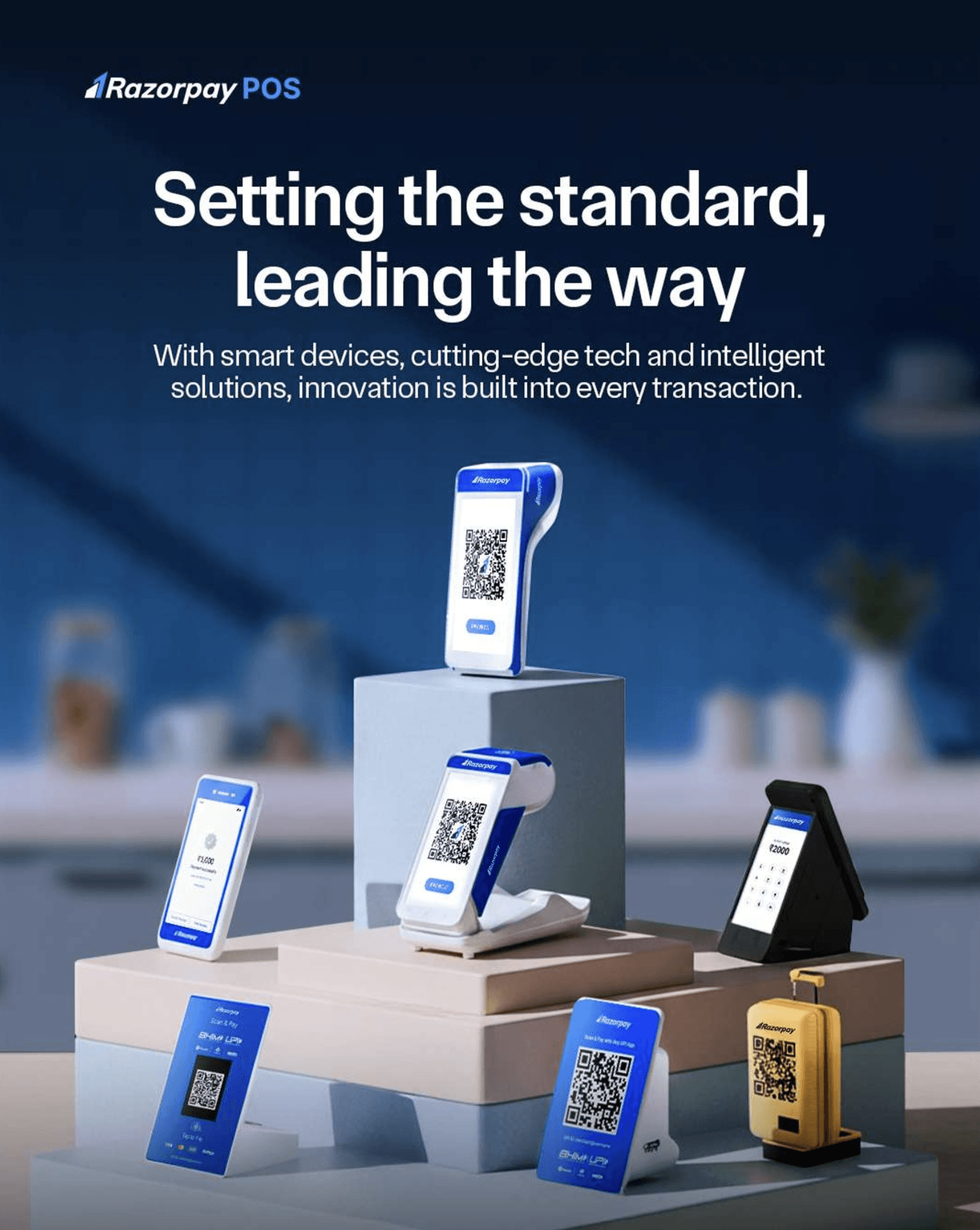
And this one is using a 4:3 ratio.
The classic 4:3 ratio offers a balanced frame for product photography, print work, and traditional layouts. This proportion provides more vertical space, making it ideal for packaging designs, book covers, and print materials.

You can even add a second image.
Create powerful visual comparisons by placing images side by side. This feature is perfect for before/after demonstrations, showing variations of a design, or presenting multiple views of physical products. Paired images tell a more complete story of your creative process.