Product Enhancement and Rebranding
Role
Product design manager
Industry
Fintech
Ezetap to Razorpay - a full product rebrand and UX overhaul shipped to 7M+ users.

The Context
Ezetap was a dominant player in offline payments in India. When Razorpay acquired it for $200M, the directive was simple: rebrand and ship.
The product had real problems - a fragmented architecture, broken core flows, and years of accumulated UX debt. We had one window to fix what actually mattered to merchants. I made the case to use it properly.

Product Problems
Four problems the rebrand couldn't fix on its own
Low product adoption
Features were buried. Merchants used a fraction of what the product offered - not because they didn't need it, but because they couldn't find it.
Poor information architecture
700+ features buried in a broken IA. Merchants couldn't navigate to what they needed when they needed it most.
Inconsistent experience
Years of band-aid decisions created a fragmented UI. Nothing felt like it belonged together. The product looked like it was built by 10 different teams.
Accumulated UX debt
Login failures, slow dashboard loading, broken transaction flows. The basics weren't working reliably for merchants processing payments every day.
The Work
Three priorities. One window.
P1 - Rebranding Ezetap to Razorpay
Not a color swap - a full visual overhaul. Applied Razorpay's design language with enough fidelity to feel native, while respecting the workflows Ezetap merchants already knew. Every surface, every screen, every interaction - rebuilt to match the brand that acquired it.
P2 - Optimisation of Core Processes
Login, dashboard loading, payment initiation - the everyday actions merchants repeat hundreds of times a day. Each had friction. Each got redesigned from first principles. Transaction steps were reduced from 7 to 3. Login failures dropped significantly. Dashboard load time cut to a fraction of before.
P3 - EMI as a First-Class Feature
EMI processing was an afterthought in the old product - bolted on, inconsistently handled. I designed it end-to-end from inception to rollout, covering all 6 EMI options across the full transaction flow. Now live for merchants across India.
UX Evaluation and Solutions
New POS design

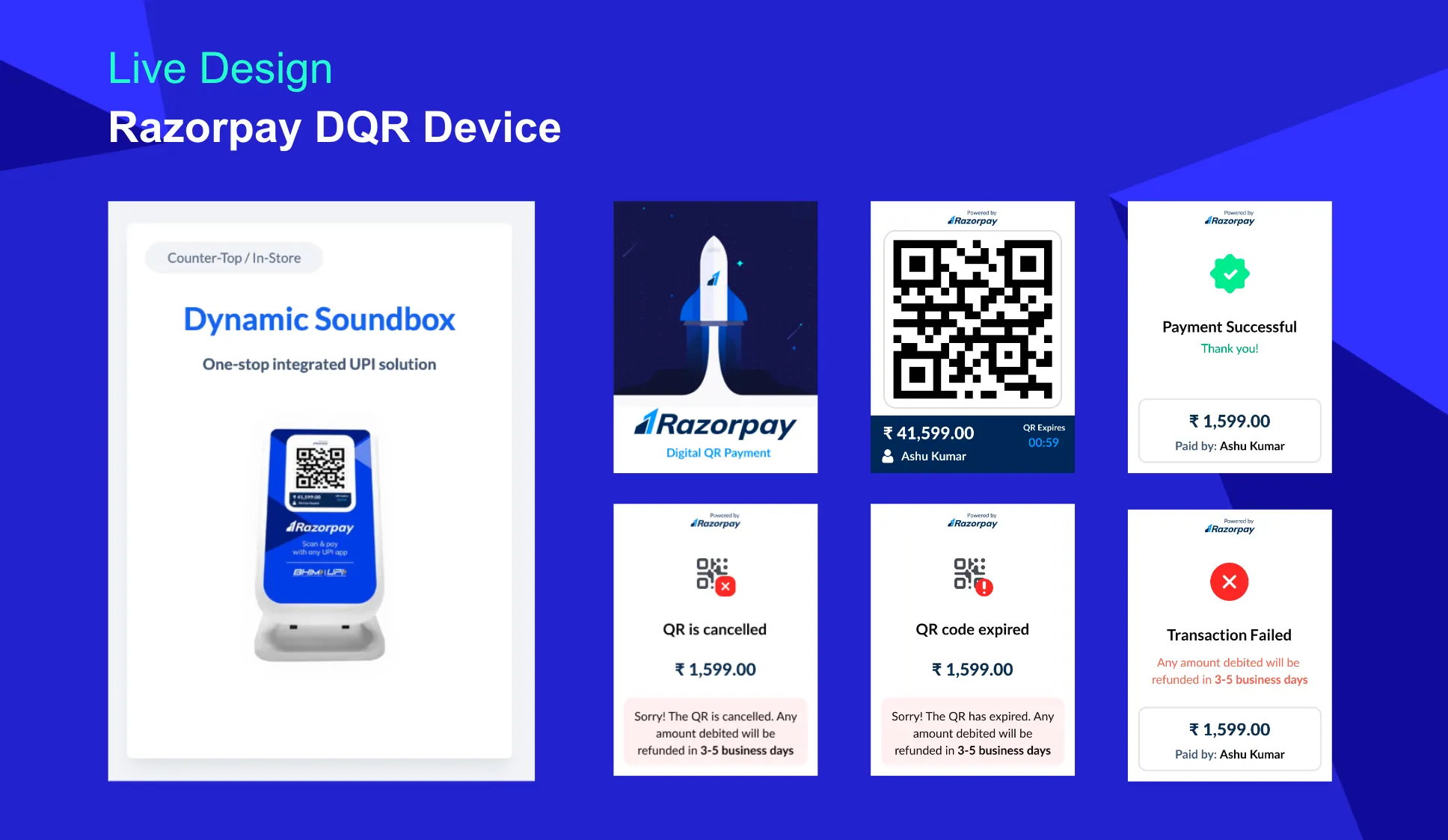
Design in action

Contextual design across devices
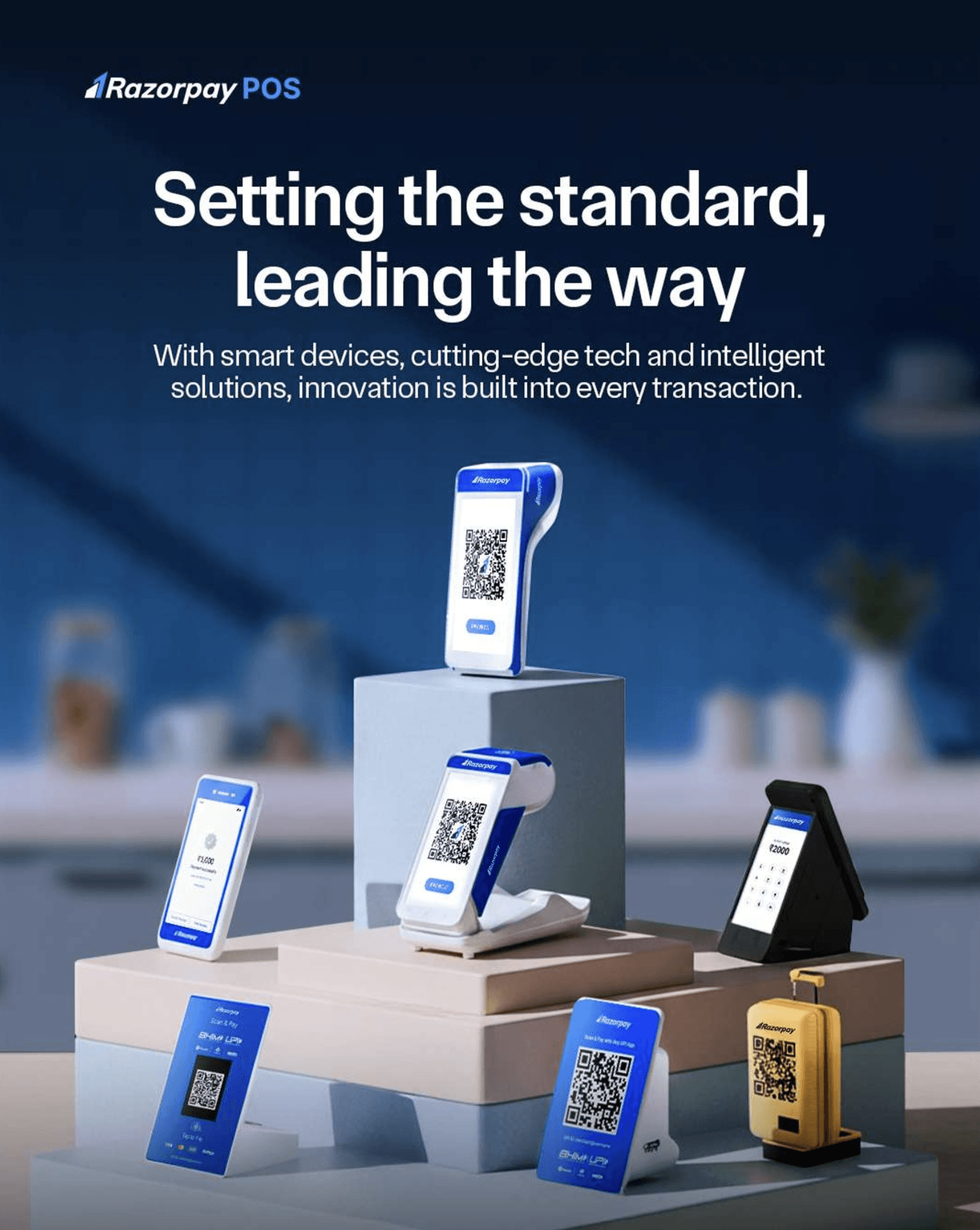

The Judgment Call
The temptation in any acquisition rebrand is to move fast and ship the minimum. That path was available to us. We took a different one.
A merchant who sees a new brand but hits the same broken flows won't trust either brand. The rebrand was the visible part. The redesign was what made it stick.
We had one window to do this right. I made the case internally and we used it.
Output Metrics
What shipped and what changed
01
Transaction simplified
Steps reduced from 7 to 3. The most repeated merchant action is now frictionless.
02
Login reliability restored
Failures down significantly. Faster login time. Dashboard loads noticeably quicker. The daily experience is no longer a source of frustration.
03
EMI launched end-to-end
All 6 EMI options designed, shipped, and consistent across the full transaction flow - from inception to rollout.
04
Live at scale
Shipped to 7M+ active users across India. Not a prototype, not a case study slide - a product live in the hands of merchants right now.
More Projects

Where I’ve shipped
